Amber Parkin, writer and organisational psychologist
Explore your
curiosity with me.
I’m an expert in how humans can show up, lead ourselves, be more creative and work better. I’m curious how we can design work cultures that embrace diversity and inclusion, particularly elevating women.

Hello, bonjour, kia ora
I’m happy you’re here. I’m Amber, writer, digital strategist, and organisational psychologist.
Based between London and Monaco, I write about self-leadership, creativity and curiosity in my weekly newsletter, Plein-Air.
I also work with a wide range of clients, from individuals to start-ups and corporations, on cool things like digital strategy, editorial and social content, customer experience, and more.

Recent articles
Here are my latest articles on working better, creative leadership, psychology, learning, and the occasional ‘living in France’ fancy.
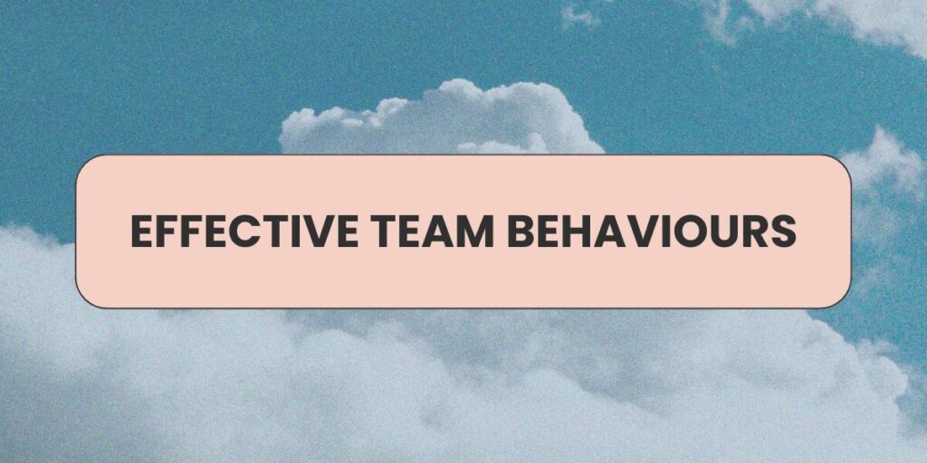
Effective team behaviours
“Great teams succeed because they are able – either intentionally or intuitively – to put in place enough of the…

Sonder, a noun
Sonder, n. the realization that each random passerby is living a life as vivid and complex as your own—populated with…
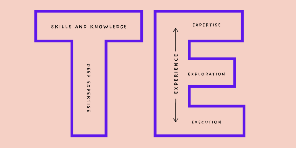
What’s your skills shape?
This newsletter is for you if you want to connect to your curiosity, learn to better show up for yourself and your community, and grow your leadership skills and career.